Infographic: The Negro Leagues map

I really like this map. It depicts the most well-known and notable teams that existed in the Negro Leagues, along with some information about each team. You can find the years each team existed, the name of their home park, and any titles won.

The text in the graphic below is a bit small, so for a larger view, just click on the image.

Negro Leagues infographic - Bill Sports maps
Bill Sports Maps

Infographic: Average MLB ticket prices, 2020

The chart by Statista below depicts the average price of tickets to MLB games by team. I continue to be stunned by how expensive Royals games are compared to teams like the Rockies or the Mets, for example. For crying out loud, they’ve got the worst record in baseball right now!

The image below is pretty tiny, so click on the chart to get a larger version and more information directly from Statista.

Average MLB ticket price 2020 - statista

Infographic: Highest-Priced Hot Dogs in MLB

I’ve posted infographics here about hot dogs previously: here and here, for example. The one from Statista below is probably the most up-to-date that I’ve managed to come across, depicting the teams with the highest-priced ballpark dogs as of 2019, juxtaposed with some of the cheapest hot dog prices.

The thought of dropping $7 on a hot dog is pretty mind-blowing to me. At that point, is seems like it’d be worth the extra hassle to just cook a couple dogs at home and find a way to smuggle them in.

MLB Highest Priced Hot Dogs - statista

Infographic: Triple Play Art

This graphic is really, really cool. Created via Tableau by Jacob Olsufka and Rody Zakovich, you can access the original, interactive version of the graphic here or by clicking the image below. Created in July 2017, the images take a unique look at the triple plays that had been turned in Major League Baseball history up to that point, and some pretty cool art results from that analysis.

Triple Play Art

Infographic: MLB and Young Fans

It’s no secret that the fan base for MLB is getting older. Fewer people are attending games in person or even watching them on television, and many in the younger generations have other interests to capture their attention. I like how this graphic depicts many of the reasons for the dwindling interest: the high costs of attending games and the difficulty of accessing a broadcast on TV, for example. This infographic was created by the Masters in Athletic Administration program at Ohio University.

mlb-and-young-fans-infographic ohio university

Infographic: How much do Canadians love baseball?

This infographic baffles me in its sparseness. According to the Environics Analytics website, the graphic was created in light of the Toronto Blue Jays’ first playoff appearance in 22 years (going on to lose the 2015 ALCS to the Kansas City Royals). Compared to what appears to be less than 20% Canadian interest in the sport, a 2006 Gallup poll found that 47% of the U.S. public considers themselves to be baseball fans.

I haven’t been able to find a statistic revealing how many Canadians took the time to watch any of the 2015 playoffs, though attendance at the Rogers Centre was just under 50,000 for each of Games 3-5. Of course, Canadian attendance at Blue Jay games in 2020 was pretty much zero thanks to the pandemic and the Blue Jays getting kicked out of their own country for the season.
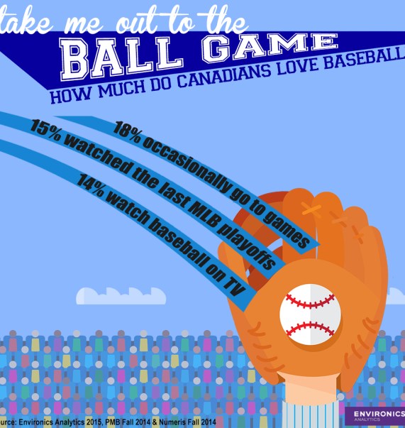
baseball-infographic Canadians and Baseball

Infographic: World Series Fun Facts

I’m not sure when this infographic was created, but it has a lot of fun information on it. It’s at least as recent as 2005, as it references the White Sox-Astros Series that year.

Edit: A friend pointed out the graphic must have been created in 2012, since it mentions it had been 104 years since the Cubs last won the Series.

infographic World Series fun facts